
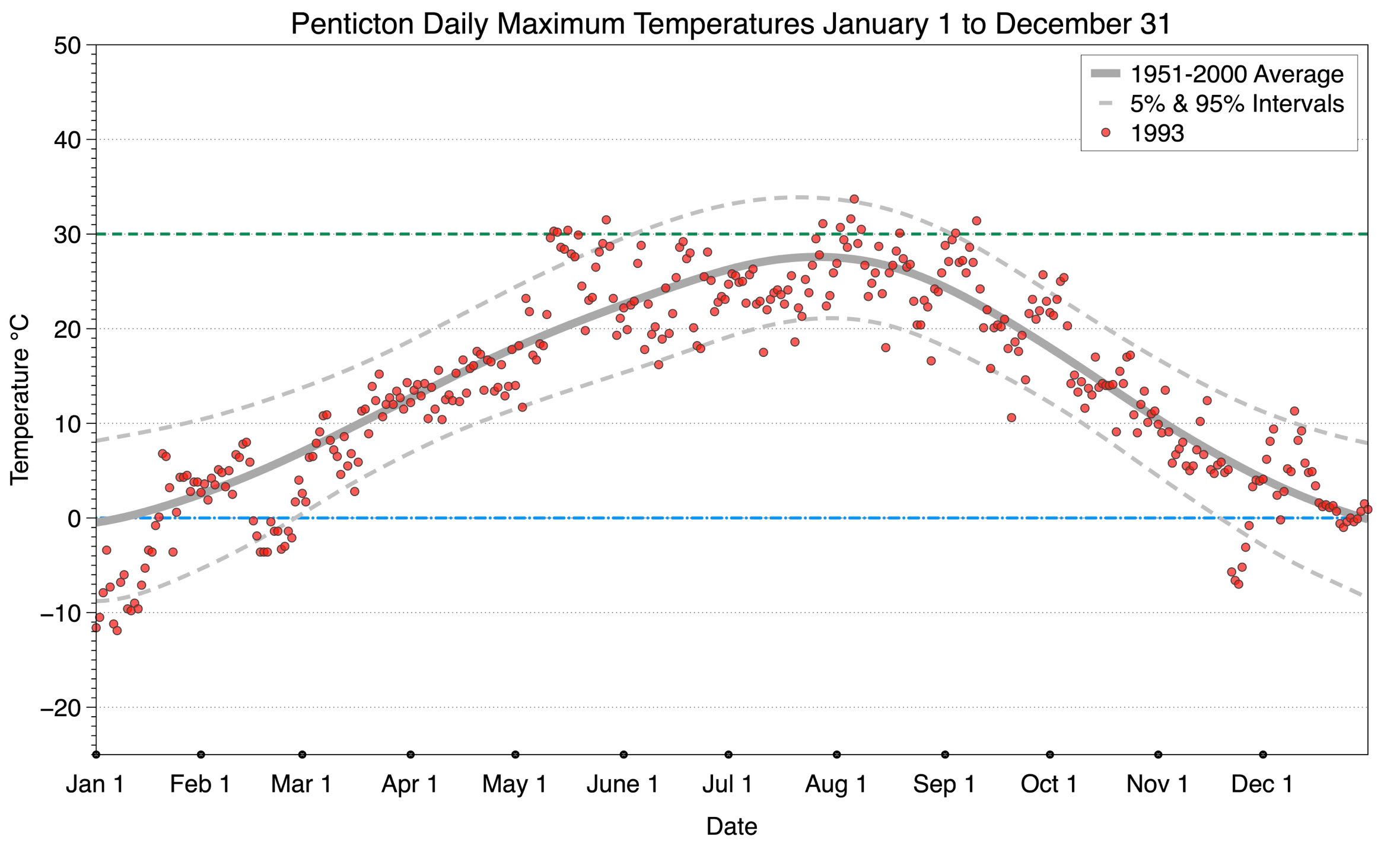
Penticton - Maximum Temperature
The graph below displays the day-to-day values of maximum daily temperature (red dots) at Penticton for the year 1993. On this graph, the dark grey thick center line is the average daily temperature calculated from 50 years of data from 1951 to 2000. The dotted light grey lines are the 5% and 95% probability intervals - about 90% of the data from 1951 to 2000 fell within these boundaries. Daily temperatures can be considered as extreme cold or extreme hot events if they that fall outside the 5% or 95% probability intervals, respectively. In Canada, temperatures above 30°C (green dashed line) are considered extreme daily temperatures.
To see the graph for any other year between 1951 to 2026 select a button below.
2021
2022
2023
2024
2025
2026
2011
2012
2013
2014
2015
2016
2017
2018
2019
2020
2001
2002
2003
2004
2005
2006
2007
2008
2009
2010
1991
1992
1993
1994
1995
1996
1997
1998
1999
2000
1981
1982
1983
1984
1985
1986
1987
1988
1989
1990
1971
1972
1973
1974
1975
1976
1977
1978
1979
1980
1961
1962
1963
1964
1965
1966
1967
1968
1969
1970
1951
1952
1953
1954
1955
1956
1957
1958
1959
1960
Copyright © 2026 Michael Pidwirny