
Vernon - Minimum Temperature
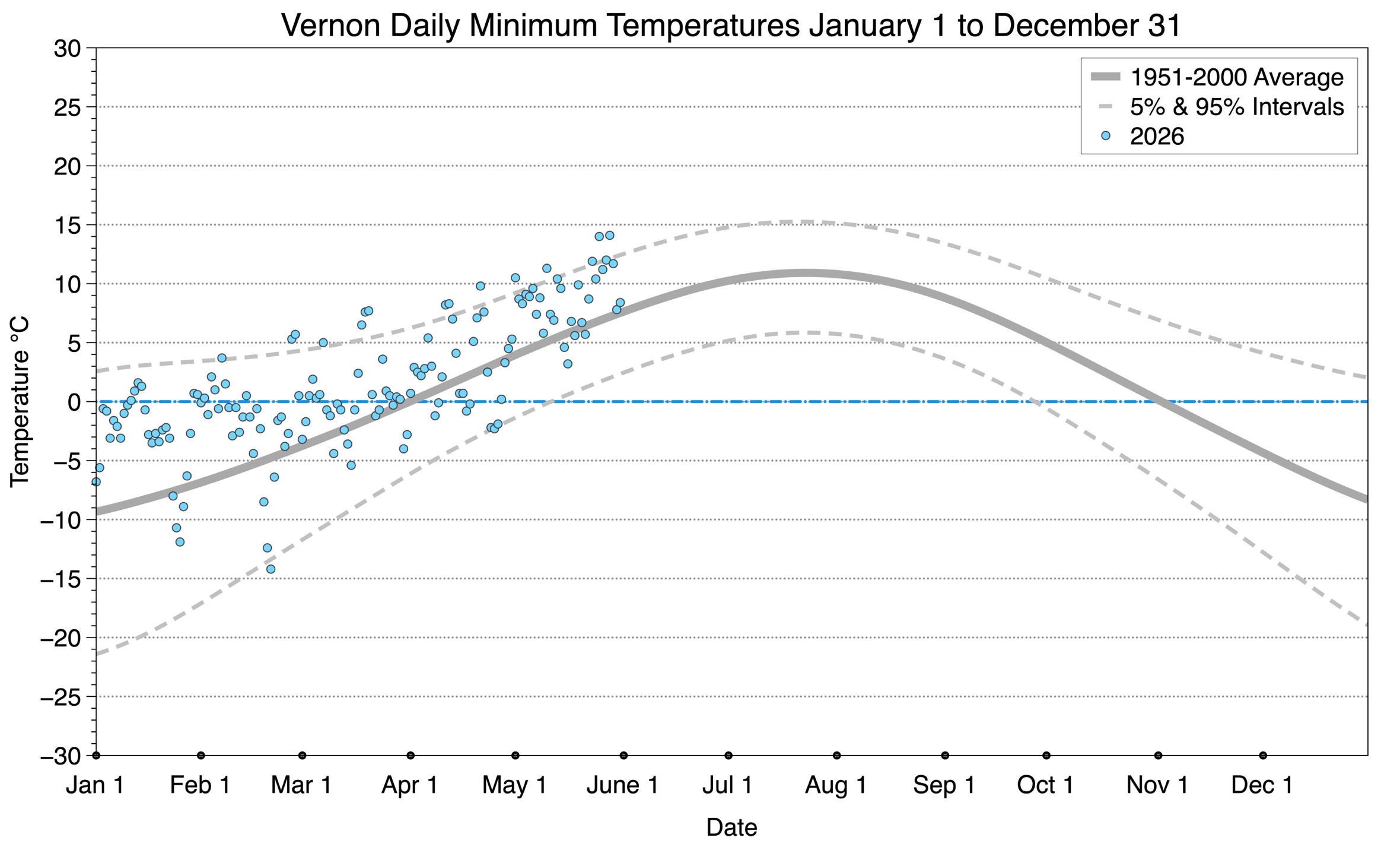
The graph below displays the day-to-day values of minimum daily temperature (blue dots) at Vernon for the year 2026. On this graph, the dark grey thick center line is the average daily temperature calculated from 50 years of data from 1951 to 2000. The dotted light grey lines are the 5% and 95% probability intervals - about 90% of the data from 1951 to 2000 fell within these boundaries. Daily temperatures can be considered as extreme cold or extreme hot events if they that fall outside the 5% or 95% probability intervals, respectively.
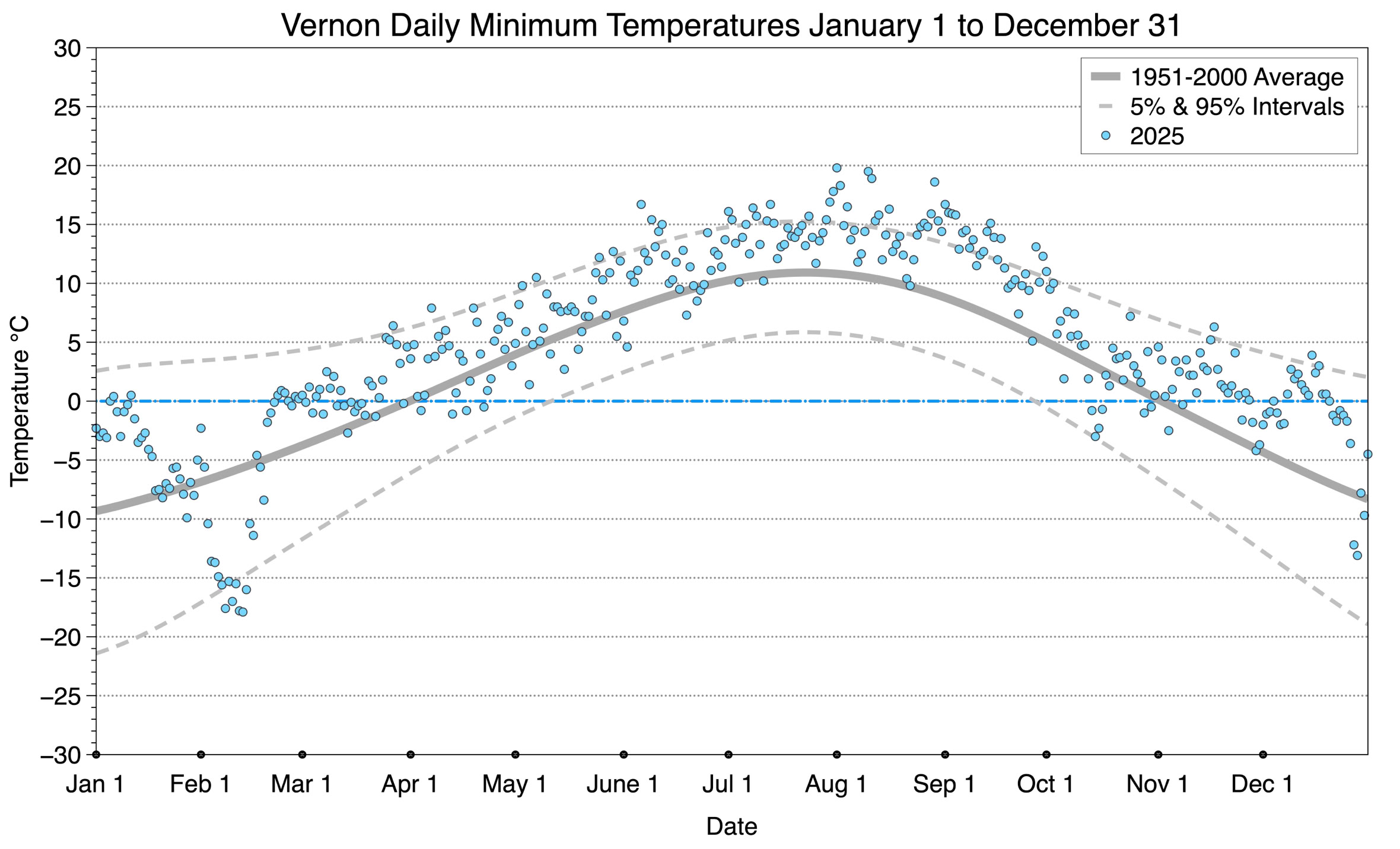
The graph below displays the day-to-day values of maximum daily temperature (blue dots) at Vernon for the previous year 2025.
To see the graph for any other year between 1951 to 2024 select a button below.
Copyright © 2026 Michael Pidwirny